

The Tools
A mockup/wireframe is fundamentally a sketch, a very basic and ugly drawing of the app. I could just use pen and paper to do it, but in the long run (and for the purposes of this article) it is better to use some digital tool.
At the beginning all these roadblocks seemed minor, not really posing a problem from my little project, but apparently even a simple interface with a bunch of screens ends up requiring much more than 300 objects. That was the deal breaker.

For this project I’m going to use an Android viewport. Designing an interface “mobile first” will help in making the app leaner and simpler, increasing its usability and portability.
Another design choice is to assume that the players will make use of paper and pencils, and have the app instruct them accordingly. One of the core design goals is to have the players draw an actual map during play, so it makes sense to have them write down other stuff too. This will both give a more traditional rpg feel to the gameplay, and make it easier to create an app that works offline and from a single device for the whole table of players.
Now let’s remember the first part of the to-do list I wrote last time:
- create a Player Account for each user
- select which accounts are active in today's Delve
- create the Quest
- create the Adventurer characters
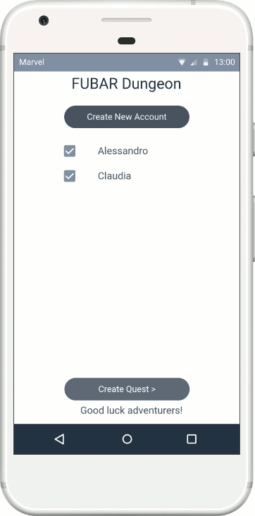
Account screen

 First, I need to show a list of current accounts where a user can either select an existing account or create a new one. It’s good to also have the app clearly instruct the user on what it expects them to do, so I’ll add a bit of textual instructions. Once we have some accounts, we’ll select them and start the game, so I’ll go ahead and put here a button to do just that, but greyed out since there are not enough accounts selected.
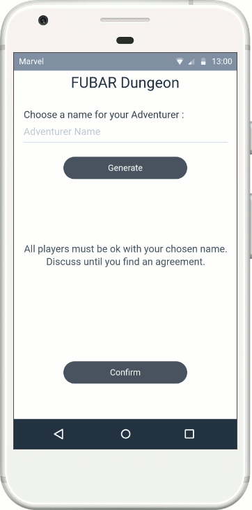
As we are a new group playing for the first time, we have no accounts. A user clicks on Create New Account and ends up on a second screen where the app asks for two info:
- a Player Name, default empty
- a Starting Level, default zero

 Other account-related data will be generated during the game, but for now the user only needs to see and provide their Name and Level, then click to save and go back to the list.
The Save Account button should be greyed out until a proper name is typed in, while the Level input field is optional. Some check should ensure that the name is unique in relation to the other accounts stored on the device, and that no weird shit is typed into the Level field.
The list screen now has no placeholder text and instead displays the new account just created. The account should be clickable, allowing the used to access (to view and edit) its data. I also added a checkbox to allow the user to select which accounts are going to play in the current delve.
Quest screen

The next screen will lead the user to the Quest creation. Here the system will generate a basic premise using the structure:
We find ourselves in a PLACE where everything looks LOOK and most of the inhabitants are FAUNA. Our quest is to ACTION a TARGET. Alas, things went south and we had to flee!
The users are instructed to read the quest aloud and then chat about it, writing down any interesting bits they want to keep in mind. The screen offers an in-app BACK button, a REROLL QUEST option and obviously the Create Adventurers button to progress with the game flow.
I’m not too happy with the central area, as it looks too much like a wall of text. Surely a graphic designer could remedy this, but for now I’ll stick with this layout. A mockup needs to be simple and functional, not pretty.
Adventurer Creation screen

The app presents the list of active Accounts framing the elements of an Adventurer character as a narrative description:
USER plays NAME of the RACE, a FORTE CLASS armed with STUFF.
Each element is shown as a button that, when clicked, brings the user to the appropriate sub-screen. Once the necessary selections are done, the interface comes back to the overall list, displaying the selected values instead of the placeholders.
Above this list the users are instructed to write on paper the final results. Below the list a button will make the game progress further. This is greyed out until all characters are fully generated.

The NAME screen allows the input of text, but offers also a button to randomly generate a fantasy name. A save button brings back to the list screen.
The RACE screen offers a selection of buttons, one for each classic fantasy race. The tabletop game allowed for the creation of new custom races; I'm leaving this out for now, but I'd love to keep the feature.


The FORTE screen offers a selection of buttons, one for each available option. The buttons themselves include explicative text. The selection is unique and will appear as greyed out for the other users.
The CLASS screen offers a selection of buttons, one for each available option. The buttons themselves include explicative text. The selection is unique and will appear as greyed out for the other users.


The STUFF screen offers two collapsible menus, one to select a defensive item, one for an offensive item. Additional text instructs the user to describe such items. A button allows to confirm the selection.
I am intentionally leaving out the options available to Player Accounts with additional Levels. On the one hand this keeps the screen design simpler, better for MVP purposes. On the other hand I have not yet properly ironed out the advancement rules in the game design itself.
For now it’s new Players, new Adventurers, no additional levels.
Final Preparations

 Once all character options are selected and the save button is pressed, the users are let to a screen about ROLE selection. At the moment this only means Leader and Cartographer, as I believe that the Quartermaster role could be made obsolete by app automation if I find a comfortable way of handling in-game “supplies”.
Next and last screen reminds the users about the starting level of the aforementioned SUPPLIES.
And that’s it for now.
In the next article I'll start working on the active play part of the app, trying to find solutions to display all the info needed to play without horribly crowding the screen.


